
As soon as we decided that we couldn’t live with the overwhelming orangeness that radiated from the floors and brick walls of our new loft, I called Jill. Besides being a good friend, Jill Pilaroscia is an architectural color consultant who chooses colors for environments ranging from private homes to office buildings, factories and shopping malls. (She also writes a delightful blog called Life in Color.) Jill has wonderfully creative ideas about color, but she also brings a wealth of technical skill to her projects as she crafts color palettes that make the most of the available light and space. She and I worked together to color a new corporate headquarters several years ago (I was the General Counsel and somehow wound up in charge of the project), and her transformation of a drab corporate office space into a cheerful and energetic workplace was miraculous. Her color choices also reduced eye strain, made the windows feel larger and the ceilings higher and helped people find their way though the building.
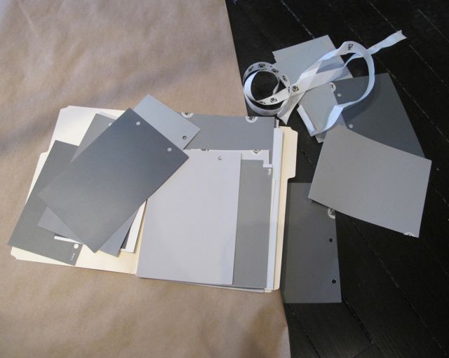
This project is simpler, of course, but it does have a few color challenges, the biggest one being the exposed brick walls. Even with the now-dark floors, those walls are still a strong force in the space and need to be balanced with cooler, quieter tones. Since the kitchen is exposed to the living, dining and entry spaces, giving it a calm, clean and sophisticated color scheme seemed like a good way to do this. Prior to Jill’s arrival, we had already ordered a great shaped tile in “stone white” for the backsplash from Heath Ceramics in California (more on that later), we’d tentatively decided on lightly veined white Calacatta marble for the countertops, and I had selected three different colors for the cabinets to break up their mass –two warm grays for the lowers (darker for the island and lighter for the others) and a white for the uppers.
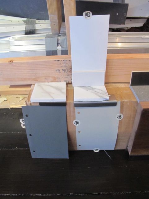
In the space, though, the grays I had chosen went brown and muddy, and my white seemed too stark and chalky next to the tile and marble samples. Jill agreed with our basic approach to the kitchen, but led us through a process that allowed us find colors that really worked in the space and with the other materials in the kitchen. The island gray we ended up with is cooler and darker than the one I had liked, which should help set off that element from the rest of the kitchen and provide a crisp contrast with its marble top. The medium gray for the lower cabinets is warm and inviting, and the white is softer and easier on the eyes than my initial choice, but still nice and clean.

Jill’s process of helping us find these colors was instructive. Here are a few things I’ve learned from her about choosing color:
1. Choose colors only in the space you’re going to use them. The quality of the light, the colors of other materials in the room and even the view outside the windows will have a strong influence on how you perceive the color.
2. Use large format color swatches to select colors. Standard chips are good for finding a general direction, but they’re just too small to inform a final choice. (All paint manufacturers make these, and you can get them through your architect, decorator, contractor and some good paint stores.)
3. Evaluate colors in the positions in which they’re going to be used. For example, look at wall colors on walls, ceiling colors ceilings and so forth. The same color can look very different on horizontal and vertical surfaces.
4. Don’t choose colors in isolation. Look at all colors and materials in a room together with surfaces that will touch actually touching, if possible. (A little mock-up, like the one below, can help with this.)
5. Don’t rush. Plan ahead so you don’t have to choose colors on the spot. Tape up a few promising options, and then walk away. When you come back later with fresh eyes, a clear winner will often emerge. Or you’ll realize that you need to start over.
6. Before you commit, see the color in the exact finish it will be used. For example, we had our contractor produce finish samples of the colors we chose in the special catalyzed paint we’re using to finish the cabinets.

It’s just a few short weeks until the cabinets are installed, and I can hardly wait to see how our colors will look when all the pieces come together. In the meantime, palettes and plans for other rooms are coming together, and we’re having a great time choosing wall paper and paint and thinking seriously about rugs and furniture.
More later!
![]()

